


The Short Answer: Your Wall Can Work — Under These Conditions
Yes, a painted wall can replace a projector screen, but only when three conditions align: the surface is smooth and flat, the finish is matte (not eggshell, satin, or gloss), and the color is bright white or light gray. As XGIMI's own guidance states, "with an even, smooth, and white surface/wall, you can easily replace a projector screen" without sacrificing too much brightness or clarity.
Miss any one of those three conditions and the compromises stack up fast — color shift, hotspots, or texture artifacts that no software can fully fix. This article is written for renters, first-time buyers, and casual viewers who want honest, practical guidance. If you're building a dedicated light-controlled home theater with a fixed-frame screen, this guide isn't for you — that audience has different requirements entirely.

Why Paint Finish Matters as Much as Color
Most people fixate on wall color and overlook finish — which is actually the more consequential variable for projection quality.
Paint finish determines how light scatters off the surface. Flat/matte paints have gloss units in the 1–9% range, meaning they scatter light diffusely in all directions — exactly what projection needs. Eggshell finishes jump to 26–40% gloss units, and semi-gloss reaches 41–69%. At those levels, the surface starts behaving more like a partial mirror, concentrating reflected light into bright spots (hotspots) at the center of the image while dimming the edges.
XGIMI's bedroom setup guide is direct on this point: "Paint them with matte finish paint in bright white or light gray. Avoid glossy finishes that create hotspots." A glossy wall doesn't just look slightly worse — it creates a mirror-like center bias that makes the image genuinely uncomfortable to watch, with viewing angles restricted to roughly ±15° before severe washout sets in.
Logic Summary: The gloss unit ranges above come from paint industry measurement standards (such as ASTM D523) used to quantify surface sheen. The hotspot and viewing-angle effects are a direct physical consequence of specular (mirror-like) reflection increasing with gloss level. These effects are most pronounced with projectors placed at short throw distances or off-axis angles — common in apartments with limited space.
The Color Spectrum: What Each Wall Tone Actually Does to Your Image
Bright White Matte — the closest thing to a screen you'll get from paint. In a darkened room, a smooth bright-white matte wall retains roughly 85–90% of the contrast performance of a basic white projector screen. Brightness loss is modest (around 8–12% compared to a 1.0-gain screen), and color accuracy stays within an acceptable range for casual viewing. Fine detail at 4K viewing distances above 8 feet remains largely intact. This is the setup XGIMI and the broader projection community consistently recommend as the baseline for wall projection. For more on this topic, see ALR vs. CLR Projector Screens: Which One Is Right for Your Living R.... For more on this topic, see Do You Need a Screen for a 4K Projector? Wall vs. Screen Image Qual.... For more on this topic, see How Intelligent Screen Adaption (ISA) is Eliminating Projector Setu....
Light Gray Matte — acceptable with calibration, but perceptibly cooler. A neutral light gray wall (think 3000–5000K equivalent tone) reduces white-level output by roughly 18–22% and compresses color gamut somewhat. With XGIMI's Wall Color Adaption engaged, auto-correction recovers a meaningful portion of color accuracy, but cannot restore the lost brightness. The image reads as slightly muted — noticeable in vibrant animated content, less so in darker drama or documentary material. For renters who can't repaint, this is a functional compromise. For more on this topic, see Why Does Auto-Keystone Correction Sometimes Make My Image Worse Ins.... For more on this topic, see How to Achieve Accurate Color Calibration When Projecting Reference....
Beige or Warm-Toned Walls — the most common problem case. Beige is the single most-reported frustration in the projection community. One Reddit user in r/hometheater captured the core issue: "You can definitely adjust the RGB gain (color temperature) settings to compensate somewhat for the wall color — adjust till white looks white." The problem is that this compensation costs brightness, and the warm cast persists in subtle ways even after correction. Beige walls absorb 25–35% more light than white surfaces and introduce a color shift that XGIMI's ISA can partially address but not eliminate. Skin tones look slightly off; bright scenes clip highlights. It's watchable, but it requires psychological adaptation.
Dark or Saturated Colors — not viable for projection. Deep navy, forest green, charcoal, or any saturated wall color absorbs so much light that even a 1500-lumen projector like the HORIZON Pro will produce a dim, color-contaminated image. These walls are outside the correction range of any auto-calibration system and require either repainting or a portable screen.
Evidence: XGIMI notes that "an uneven or colored wall may reflect the wrong colors… causing tiny shadows" — a physical consequence of the wall's pigment absorbing and re-emitting light unevenly across the projected area.
Texture Is a Silent Resolution Killer
Wall texture is the variable most buyers don't think about until they see the result. Even a wall that looks smooth under normal lighting will reveal its surface structure under a projector beam. As XGIMI's setup guide confirms, "wall texture, even when painted smooth, creates subtle patterns in the image."
For 1080p content at typical living-room viewing distances, light orange-peel texture is often tolerable. At 4K, the math changes. Micro-shadows cast by surface irregularities effectively degrade sharpness — the kind of fine detail that makes 4K meaningful (facial pores, fabric weave, text overlays) gets softened or obscured. On a heavily textured knockdown or skip-trowel wall, the effective resolution can drop to something closer to 1080p equivalent, making the 4K capability of a projector like the HORIZON Pro largely academic.
The fix isn't always repainting. A standalone portable screen — even a basic pull-up model — eliminates texture artifacts entirely and is a practical option for renters who can't modify their walls.

Understanding Screen Gain: Why Walls Start at a Disadvantage
Screen gain measures how much light a surface reflects compared to a standard reference material — that reference is defined as gain 1.0. A typical matte white wall has a gain of roughly 0.8–1.0, meaning it reflects the same or slightly less light than the reference. A dedicated matte white projector screen is engineered to hit exactly 1.0 or slightly above, with consistent reflectance across the entire surface.
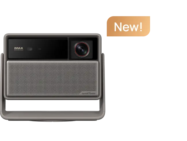
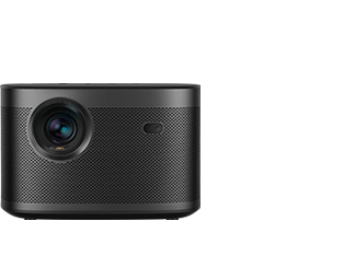
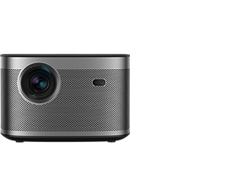
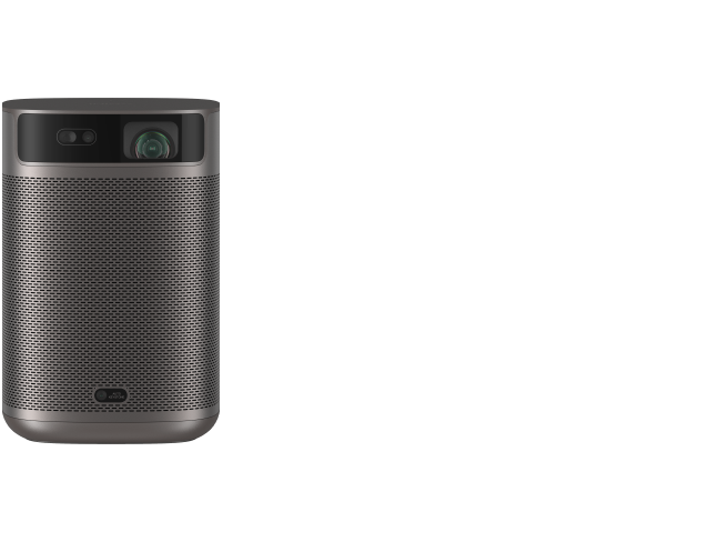
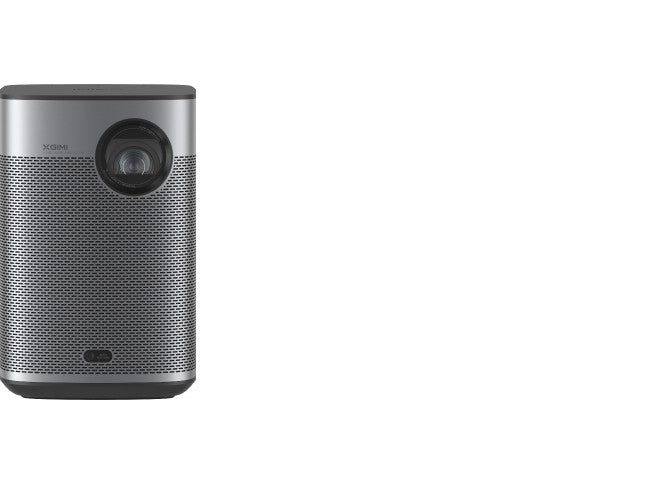
The practical consequence: projectors need approximately 30–50% more lumens to achieve the same perceived brightness on a wall versus a purpose-built screen, due to the wall's lower gain and surface inconsistencies. This is why projector brightness matters more for wall projection than for screen projection — and why the gap between the HORIZON Pro (1500 ISO Lumens) and the Halo+ (700 ISO Lumens) becomes significant in this context.
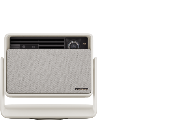
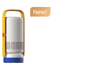
At 700 lumens on a beige wall in a room with any ambient light, the Halo+ will struggle. On a bright-white matte wall in a fully darkened room, it performs acceptably for casual viewing. The HORIZON Pro's extra headroom gives it more tolerance for wall imperfections and minor ambient light intrusion.
Evidence: XGIMI acknowledges this ceiling effect directly: "both types lose some black depth in rooms with light-colored walls" — even a white wall reflects ambient light back onto the projected image, raising the black floor and reducing perceived contrast according to colorimetric standards.

What XGIMI's Auto Wall-Color Correction Actually Does (and Doesn't Do)
XGIMI's Wall Color Adaption feature — part of the ISA (Intelligent Screen Adaption) system — analyzes the wall's color temperature and applies a compensating color profile to the projected image. The system operates across a color temperature range of 3000K–15000K, covering most painted wall tones from warm beige to cool gray.
What it does well: it shifts the white point toward neutral, reducing the most obvious color cast on off-white walls. For light gray or slightly warm walls, the correction is meaningful and noticeably improves color accuracy in casual viewing.
What it cannot do: restore brightness lost to wall absorption, correct for surface texture, or function on wallpaper, dirty surfaces, or walls with decorative patterns. The feature also performs best in dimly lit environments — in bright rooms, the correction algorithm has less reliable reference data to work from.
The community consensus from r/projectors reflects a similar finding: manual RGB gain adjustments can compensate "somewhat" for wall color, but the correction is never complete, and the brightness trade-off is real. XGIMI's automated version of this process is more convenient but subject to the same physical constraints.
A Practical Decision Framework for Your Wall
Before deciding whether your wall is projection-ready, run through this checklist:
- Color check: Is the wall bright white or light gray? If yes, proceed. If beige or warmer, expect color correction to be needed. If dark or saturated, plan for a portable screen.
- Finish check: Run your hand across the surface in raking light. If you see sheen or reflection, it's likely eggshell or satin — not ideal. Flat/matte should look uniformly dull.
- Texture check: Shine a flashlight at a low angle across the wall. Visible bumps, orange-peel, or skip-trowel patterns will appear in your projected image.
- Flatness check: Look for nail holes, patches, or seams. Minor imperfections (2–3mm defects) become visible in bright scenes but are masked during most movie content — less critical than texture.
- Lighting check: Can you darken the room fully? Ambient light is the fastest way to degrade wall projection quality. Ceiling lights directly above the projection area cause the most damage to contrast.
If your wall passes all five checks, a smooth matte white wall in a dark room is a genuinely viable projection surface. If it fails two or more, the XGIMI projector screen buying guide is worth reading before your next movie night.
The Middle Path: Projector Paint
If you own (not rent) your space and want wall projection without buying a screen, projector-specific paint is a legitimate upgrade. As XGIMI notes, "projector-painted walls reflect light more accurately and efficiently, almost as good as a standard projector screen." These paints are formulated to hit a consistent gain near 1.0 with a neutral white or light gray tone, eliminating the color-cast issues of standard interior paint.
The community debate on projector paint centers on whether the improvement over high-quality regular matte white paint is worth the cost. One Reddit user put it plainly: "The thing is, I do have the budget for projector paint, but I'd only be willing to spend if there was a very noticeable difference." The honest answer: for casual viewing on an already-smooth bright-white wall, the difference is modest. For a wall with slight color tint or minor texture, projector paint offers a more meaningful improvement.
When to Stop Optimizing the Wall and Buy a Screen
Some situations make wall projection a poor long-term choice regardless of how well you prepare the surface:
- You have a beige or off-white rental wall you cannot repaint. Auto correction helps, but the brightness loss is permanent. A portable projector screen that rolls up for storage is the practical solution.
- You're using a lower-lumen portable like the Halo+ (700 ISO Lumens) in any room with ambient light. The brightness budget simply isn't there to compensate for wall inefficiency and ambient wash simultaneously.
- You're watching 4K content on a textured wall. The resolution investment is wasted. A basic 1.0-gain matte white screen will deliver more of what you paid for.
- You want better contrast without repainting. A gray screen absorbs ambient light while reflecting projected output, improving black depth in ways a white wall cannot match — especially relevant in living rooms where complete darkness is impractical.
For readers who've confirmed their wall works: the HORIZON Pro and Halo+ both include ISA auto-correction that handles wall color calibration automatically — no manual RGB tweaking required. For readers whose wall doesn't pass the checklist, the screen buying guide covers the full range from basic pull-up screens to ALR options for light-challenged rooms.
If you're still deciding on a projector altogether, the first projector buying guide walks through lumen requirements, throw ratios, and smart features before you commit.


