


Projecting reference images for outdoor murals can deliver accurate color matching when you prioritize on-site calibration under controlled nighttime conditions rather than relying on factory presets or daytime setups. For muralists and street artists, the key is managing ambient light spill, wall surface effects, and projector picture settings so the projected digital design closely aligns with your physical paint palette.

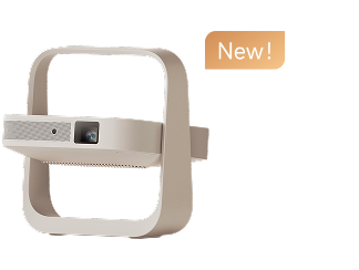
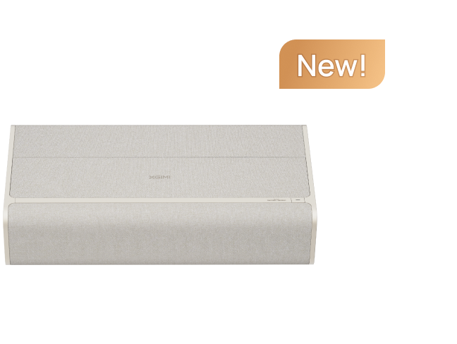
This practical workflow helps reduce wasted paint and rework by turning color calibration into a repeatable on-site process. While portable projectors like those in the Halo series offer the brightness and flexibility needed for exterior walls, success depends more on your setup stability than on any single device spec. For more on this topic, see New XGIMI 4K Projectors TITAN Noir Series Launched: Reserve Now!. For more on this topic, see How to Store and Transport a Portable Projector.
Understanding the Challenges of Outdoor Projection for Mural Work
Outdoor environments introduce variables that indoor studios rarely face. Ambient daylight or street lighting can wash out projected colors, lowering contrast and making subtle hues hard to judge against paint samples. Textured exterior walls further distort perception because surface irregularities scatter light unevenly, altering how colors appear from different viewing angles.
Portable projectors also vary in color performance across models and locations. Brightness, contrast, gamma, and color temperature settings that work well indoors often shift outdoors, especially when the throw distance changes or the projector must be repositioned. Without a structured calibration approach, artists risk transferring designs that look correct on the wall but mismatch once painted.
The risk is real: projected colors can appear significantly different from the final mural due to these factors, leading to frustration and extra labor. Recognizing these boundaries early helps artists decide whether a full calibration is worthwhile or if simpler outline tracing makes more sense.
Common Myths About Projector Color Accuracy for Artists
Many artists assume that nighttime projection automatically solves color issues or that default projector settings provide reliable references. In reality, night helps reduce ambient interference but does not eliminate the need for deliberate calibration. Factory modes are often optimized for vibrant video playback rather than neutral color matching, which can shift hues and saturation enough to affect paint choices. For more on this topic, see How Does Flicker Rate in Projectors Affect Eye Strain During Extend....

Another misconception is that high resolution alone guarantees accuracy. For mural reference work, ambient light control, wall texture, and picture settings usually matter more than pixel count. Similarly, if an image looks good to the eye, many assume the colors are correct; however, human vision adapts quickly, masking biases that become obvious only when compared directly to paint swatches.
Portable projectors are not interchangeable for precise art tasks either. Models differ in color mode quality and calibration flexibility, so consistent results require testing your specific unit in the actual environment.
When Calibration Works Best: Scenario Guidance
Successful color matching flips based on lighting, surface, and setup stability. In a dark night with minimal spill on a smooth wall using reference images, a single calibration pass often suffices with low risk of mismatch. Nighttime with street lights or dusk conditions raises the risk for mid-tones and neutrals, requiring on-site recalibration after locking position and brightness.
Daytime or bright ambient light makes accurate color matching unreliable, pushing artists toward simplified outlines rather than full color references. Highly textured or uneven walls introduce local color breaks, so testing with larger patches is essential. Unstable portable setups that require frequent repositioning also demand repeated checks because throw distance changes affect perceived color.
For content, still reference images allow tighter calibration than video, where motion consistency takes priority over perfect static hues. LED-based portable projectors tend to offer more flexible tweaks for temporary setups, while laser models reward fixed, repeatable placements.
Here is an illustrative overview of how conditions affect readiness:
Outdoor Mural Projector Calibration: Scenario Risk and Minimum Readiness
Illustrative scenario chart for deciding whether outdoor color matching is likely reliable or needs recalibration. Risk scores are heuristic; brightness values are bounded planning ranges, not lab measurements.
View chart data
| Category | Calibration risk (0=low, 5=high) | Min brightness for workable color matching (lumens, illustrative) |
|---|---|---|
| Dark night, smooth wall | 1.0 | 300.0 |
| Night with street lights | 3.0 | 500.0 |
| Dusk / mixed ambient | 3.0 | 600.0 |
| Textured wall | 4.0 | 700.0 |
| Daytime / bright ambient | 5.0 | 1000.0 |
| Portable setup with unstable placement | 4.0 | 700.0 |
Heuristic synthesis from scenario matrix logic: ambient light, wall texture, projector output, color mode availability, stability, and content type. Brightness range is illustrative for portable outdoor projectors (about 300-1000 lumens) and should be treated as a planning threshold, not a measured standard.
This chart offers a conservative planning aid. The values are heuristic and should guide judgment rather than serve as strict requirements. Higher risk scenarios generally demand more brightness and frequent verification to maintain usable color references.
Step-by-Step Workflow for Accurate Color Calibration Outdoors
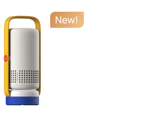
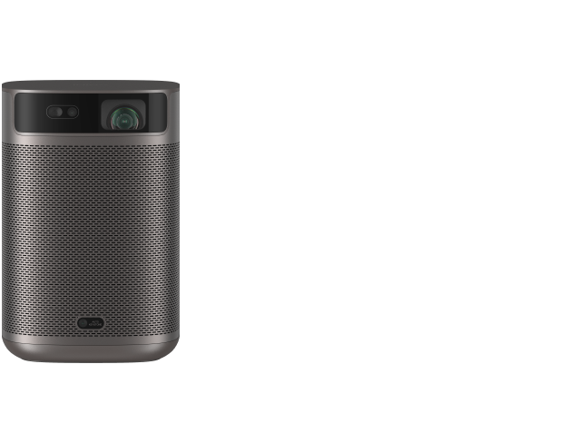
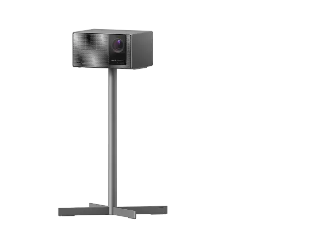
Begin by selecting the right time and location. Aim for consistent nighttime conditions with minimal variable light spill. Position your portable projector on a stable mount at a fixed distance from the wall to avoid throw ratio changes during the session. For best results with mural scaling, choose a model with sufficient brightness to overcome residual ambient light, such as those in the Halo+ portable projector lineup.
Next, prepare your reference materials. Load the digital design onto the projector and place physical paint swatches or test patches directly on the wall near the projection area. Use a neutral gray card or known color reference if available to establish a baseline.
Adjust core picture settings systematically. Start in a neutral or cinema color mode rather than vivid presets to minimize artificial saturation boosts. Set brightness and contrast to balance highlight and shadow detail without clipping. Fine-tune gamma to preserve mid-tone accuracy, and adjust color temperature toward 6500K for more natural rendering. Many portable projectors include user-adjustable RGB gain and offset controls; use these sparingly while comparing projected swatches to your palette. For more on this topic, see How Does Light Source Temperature Affect Projector Color Accuracy a....
Perform a practical patch test. Project large color blocks matching key elements of your design and view them from the intended painting distance and angle. Make incremental adjustments until the projected hues align as closely as possible with your paints under the actual lighting. Account for wall color bleed by testing on a small primed section if the surface is tinted.
Lock in the setup once calibration looks consistent across several test areas. Mark the projector position clearly and avoid moving it. For added precision, consider using the projector's keystone and focus features to maintain sharpness without altering color performance.
If working across multiple sessions, recalibrate at the start of each one because even slight changes in ambient light can shift results. This repeatable process helps ensure your projected reference supports confident large-scale execution.
Practical Tips for Managing Wall Texture and Ambient Light
Textured walls require larger test patches because fine details get lost in surface variations. Focus calibration on overall hue and value rather than exact saturation when texture is pronounced. Consider applying a base coat of primer to create a more neutral projection surface in critical areas.
To combat ambient light, schedule work during the darkest feasible hours and use temporary light blockers like black drapes if street lighting is an issue. Higher-lumen portable projectors maintain better contrast in these conditions; refer to guides on choosing projectors in different ambient light for environment-specific benchmarks.
When possible, view the projection under both projector-only and mixed lighting to simulate how the final mural will appear during daytime. This helps set realistic expectations for color fidelity.
Choosing the Right Portable Projector for Mural Applications
Not every portable projector excels at art reference work. Prioritize models with strong color accuracy controls, sufficient brightness for outdoor use, and flexible placement options. Features like auto-focus and keystone correction simplify setup without compromising picture settings.
The MoGo series and Halo lineup are popular among creative users for their balance of portability, battery life, and image quality. Look for projectors that support custom picture modes and offer good low-light performance, as these reduce calibration time on site.
Avoid relying solely on marketing lumen claims. Real-world usability in mixed lighting often depends on ANSI-style measurements and consistent color output. Resources explaining projector brightness standards can help separate hype from practical performance.
Safety and Practical Considerations
This article discusses setup and comfort factors for projector use in artistic applications. It does not constitute professional advice on vision health or medical concerns. Projected light should never be viewed directly for extended periods. If you experience eye strain, headaches, or other discomfort during use, take breaks and consult a qualified professional. Color calibration for art is subjective and depends on individual perception, room conditions, and device quality.
Final Checklist Before Starting Your Mural
- Confirm ambient light is stable and minimal
- Secure the projector in a fixed, level position
- Test color patches against your actual paint palette on the wall
- Adjust settings in a neutral mode and verify from painting distance
- Mark reference points for consistent alignment
- Prepare for recalibration if conditions change
Following these steps transforms a portable projector from an entertainment device into a reliable creative tool. With practice, outdoor muralists can achieve color references close enough to their digital designs to execute large-scale works with confidence.
By treating calibration as an on-site, environment-aware process rather than a one-time indoor adjustment, artists minimize surprises and focus on the creative work that matters most. Experiment with your specific projector and location to refine the workflow that best suits your style.


