


Even the brightest projector can deliver a washed-out image if your room's walls, ceiling, and surfaces bounce too much ambient light back toward the screen. Choosing colors and finishes that absorb rather than reflect light is one of the most effective, low-cost ways to improve contrast and color accuracy without replacing your projector.
Darker, matte surfaces generally reduce stray light bounce and help the projected image stand out. This guide explains the science of room reflectance, recommends practical color schemes and paint finishes, and shows when surface changes deliver meaningful gains versus when you should consider brighter models or ambient light rejection (ALR) screens instead.
Why Room Surfaces Matter for Projector Performance
Ambient light reflection occurs when stray light from windows, lamps, or even the projector itself hits light-colored or glossy surfaces and scatters back onto the projection surface. This added illumination reduces perceived contrast and makes blacks look gray, colors appear faded, and fine details harder to see.
Room surface reflectance plays a major role in ambient illumination, so lower-reflectance finishes can help control bounce light. Shiny surfaces can create reflected glare; matte ceiling and wall finishes are commonly recommended to reduce it. A projector can look washed out in a reflective or bright room even when its output is normal; the room can be the limiting factor.
In dedicated home theaters, very matte or flat paint is commonly recommended to keep reflected light down. By selecting appropriate colors and sheens, you can minimize these issues and get more consistent performance from your projector.
Best Room Color Schemes for Projector Setups
The goal is to choose hues that absorb rather than reflect light while still fitting your overall décor. Darker tones generally perform better because they reflect less light and help contain projected light within the viewing area.
Recommended color families include:
- Deep charcoal or black: These provide the strongest light absorption and are popular in dedicated theaters for maximum contrast.
- Navy, forest green, or burgundy: These offer good absorption with a touch more warmth and visual interest than pure black.
- Dark gray or taupe: Balanced options that reduce reflection without making the room feel overly cave-like.
Lighter colors such as beige, soft gray, or off-white can increase room brightness, but that can be a drawback in projection spaces where the goal is to reduce bounce light. If your room must remain bright for daytime use, these lighter tones may still work as a compromise, but expect some trade-off in image pop.
For multi-purpose living rooms or rentals, consider painting only the wall behind the screen and the side walls in darker tones while keeping the ceiling and opposite wall lighter. This approach minimizes reflection near the projection area without a full room makeover.
Choosing the Right Paint Finish to Minimize Reflection
The sheen of your paint affects how light scatters as much as the color does. A matte surface reflects light mostly diffusely, which helps reduce mirror-like reflections.
Matte or flat finishes are the top choice for projector rooms. They diffuse light evenly and minimize hot spots or glare on the screen. In cinema-style projection rooms, very matte or flat paint is commonly recommended to keep reflected light down.
Eggshell and satin offer a middle ground with slight sheen for easier cleaning while still keeping reflections low. Avoid semi-gloss or high-gloss paints on walls and ceilings near the screen, as these create strong specular reflections that can wash out the image.
A non-reflective finish helps minimize glare from surrounding surfaces. Use light, matte colors and non-reflective finishes on surrounding surfaces to help reduce reflected glare.
For ceilings, flat white or off-white matte paint is common, but consider a very dark matte ceiling in dedicated rooms to further control bounce. Floors benefit from dark carpet or rugs rather than glossy hardwood or tile.
Practical Room Treatment Checklist
Optimizing your space goes beyond wall color. Follow this checklist to reduce ambient light reflection systematically:
- Paint the wall behind the screen and adjacent walls in dark matte colors.
- Use flat or matte paint on the ceiling to prevent overhead reflections.
- Cover or replace glossy furniture, trim, and doors with matte versions or fabrics.
- Add dark curtains or blackout shades to control window light.
- Place rugs or carpet on floors to absorb rather than reflect light from below.
- Position the projector and screen to avoid direct light paths from lamps or windows.
Shiny floors and other glossy surfaces can contribute to reflected glare. In rental apartments where permanent changes are limited, focus on removable solutions such as dark fabric wall hangings, temporary matte wall panels, or heavy curtains.
Myth vs Reality: Common Misconceptions About Projector Room Colors
Myth: The room must be completely black for a good picture. Reality: While darker walls help, the real goal is controlling stray light. Moderate dark tones with good light control often deliver excellent results without making the space feel like a cave.
Myth: Glossy paint is fine if your projector is bright enough. Reality: Glossy finishes tend to increase specular reflections; they are more likely to hurt perceived contrast than help, especially in smaller or shared rooms.
Myth: Paint color alone solves projector washout. Reality: Room color is only one lever. If the room stays bright during viewing, or the projector is used in daytime, paint changes may not be enough on their own.
When Room Changes Are Not Enough: Upgrade Paths
Room treatments improve image quality but have limits. If the room has glossy ceilings, shiny flooring, bright trim, or lots of daylight spill, wall color can reduce part of the problem but often cannot overcome the broader reflection pattern that lowers contrast.
Do not rely on paint alone if the room must stay bright or multi-purpose, you cannot treat walls and ceiling thoroughly, or the image remains washed out after reasonable darkening. In these cases, the practical next step is often an ALR screen or a higher-lumen projector.
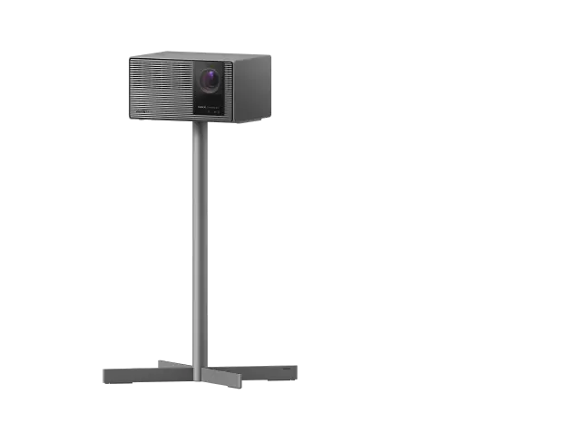
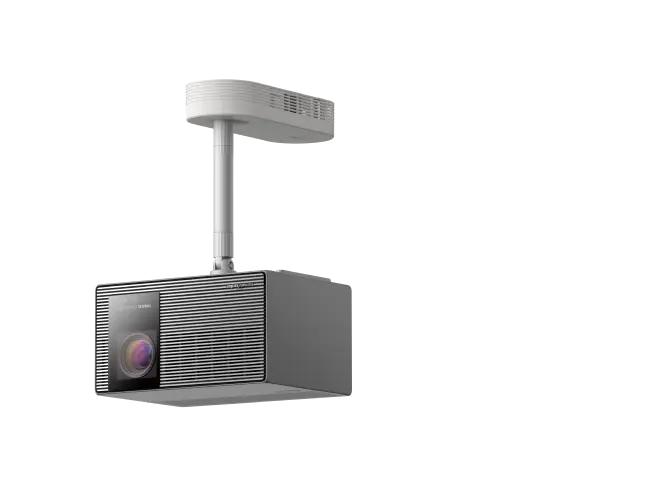
If you cannot darken the room enough, an ALR screen can be a practical fallback alongside brighter projector settings. Models such as the XGIMI HORIZON Ultra with 2300 lumens or the HORIZON 20 Max with 5700 ISO lumens perform better in challenging environments. Pairing them with an XGIMI 100" UST ALR Screen can deliver strong contrast even when room treatments are limited.
For more on selecting the right brightness for your space, see our guide to ANSI vs. ISO vs. CCB Lumens.
Approximate Surface Reflectance by Room Color and Finish
Illustrative comparison for projector-friendly room surfaces; values are approximate reflectance ranges, not measured lab data.
View chart data
| Category | Matte/Flat | Eggshell | Semi-Gloss | Gloss |
|---|---|---|---|---|
| Black | 7.0 | 9.0 | 11.0 | 13.0 |
| Dark Gray | 20.0 | 23.0 | 26.0 | 29.0 |
| Navy | 18.0 | 20.0 | 23.0 | 26.0 |
| Beige | 70.0 | 74.0 | 77.0 | 80.0 |
| White | 85.0 | 88.0 | 90.0 | 92.0 |
Heuristic, illustrative reflectance ranges synthesized from the provided context: dark walls reflect less light; light colors increase brightness but can worsen washout; matte finishes reduce specular reflections and glare. Values are approximate guidance only, not measured lab data.
The chart above shows approximate reflectance levels across common colors and finishes. Darker matte options stay well below 30% reflectance, while lighter and glossier surfaces climb above 70%. These are heuristic guidelines synthesized from lighting design principles to help you compare relative performance.
How to Choose the Right Approach for Your Room
Consider your specific scenario before making changes:
- Dedicated theater room: Prioritize very matte, dark finishes on all major surfaces for the biggest contrast gains.
- Multi-purpose living room: Use darker matte paint on key walls and add curtains or an ALR screen for balanced results.
- Rental or apartment: Focus on removable dark panels, matte fabrics, or curtains rather than permanent paint.
- Daytime viewing: Room finishes alone offer limited help; combine them with higher-lumen projectors or ALR screens.
If reflective surfaces extend beyond walls or ambient light cannot be controlled well, finish changes help but are often not enough on their own. Move budget toward brightness or ALR in those cases.
Important Note on Comfort and Viewing: This article discusses room setup and comfort factors that may affect perceived image quality and eye strain. It does not constitute medical advice. If you experience persistent eye discomfort, headaches, or have existing vision conditions, consult a qualified eye care professional.
Final Recommendations
Start with matte or flat dark paint on the walls surrounding your screen and ceiling. These changes often provide noticeable improvements in contrast and color depth. Combine them with practical light control such as curtains and non-reflective flooring for best results.
When room modifications are limited, consider upgrading to a brighter projector from the XGIMI home projector collection or adding an ALR screen. Our projector setup guide offers additional tips on placement and optimization.
By thoughtfully selecting colors and finishes, you can create a more immersive viewing environment that lets your projector perform at its best. The right combination depends on your room's use, lighting conditions, and willingness to make changes, but the principles remain consistent: reduce reflection to preserve contrast.


